Multi-Factor Authentication
AWIN: Global Affiliate Marketing Network
Challenge:
The task was 1) to a create a prompt after users log in; and 2) to explain security steps to enable MFA. There was a need for user friendly language that simplified the process but also encouraged enrollment.
What I did:
Drawing from the most widely used and trusted MFA examples (banking, email, & universities), I began by noting the lexical choices for articulating each step, and tailored the language to suit the AWIN UI.
I proposed a horizontal layout for screen 1 as it gives a snapshot of the entire process; and switched to a vertical layout for the step by step process for the second part as there were more steps involved and I wanted to separate out the screens to avoid a visually chaotic appearance.
Process:
I researched and elicited as much info as possible regarding the typical users and I learned that it was critical that the language was easily translatable for locations outside the UK and US, but also straightforward enough for non-native English speakers. The terminology used reflects these lexical challenges, drawing from common words in usage.
Outcome:
The final copy uses terms that distinguish between potentially confusing instructions (e.g. logging in to the UI, and signing in to the mobile app). The screens also reflect choices that highlight the most vital bits of information for the MFA process by cascading information as needed.
The tone and voice achieve trust and transparency with the user by illustrating the steps involved, but also establish empathy and respect for the user's time by offering a "not now" button for example.
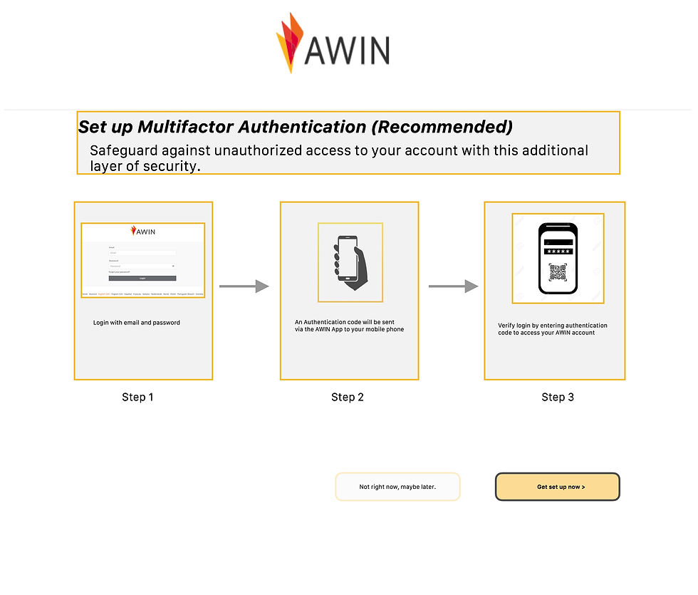
The screen below illustrates my initial plans to convey to the team all of the step-by-step process for initiating MFA. The idea was to capture a snapshot that made for a succinct visual aid showcasing my copy, buttons, labels, etc for the entire process. However, for the UI I recommended a vertical layout (see further below) whereby each step was shown in descending order as this uncluttered users' screens while proceeding with the MFA set up.

